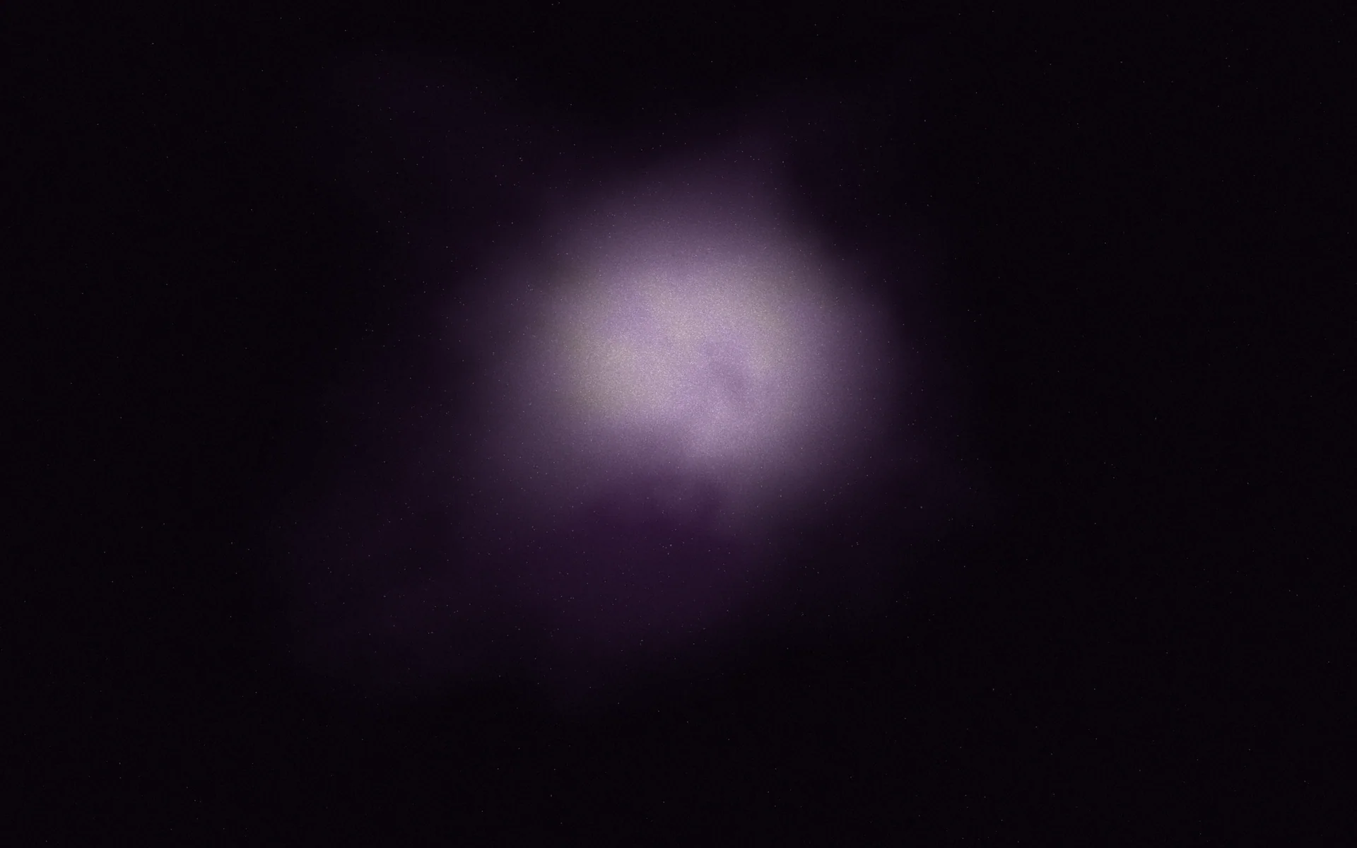
The short version
- A black gradient is a blend between near-black tones, or from black into a colour, used to give dark designs depth instead of a flat void.
- The best black gradients avoid pure #000000 and use tinted blacks that carry a small amount of hue, such as blue-black, warm espresso or aubergine.
- Dark gradients band easily because there are few brightness levels between near-black values, so they usually need grain or a wider range.
- Body text on a black gradient reads best in a soft off-white, and secondary grey text still needs a contrast ratio of at least 4.5:1.
- Black gradients suit launches, luxury, music, nightlife and dark-mode products, where the dark field makes one accent colour glow.
On this page
A black gradient is a blend that moves between near-black tones, or from black into a colour, so a dark design has depth and light instead of a flat void. The ones that look expensive almost never use pure #000000. They start from a tinted black, such as #0b0b10, let the lightness change by only a few percent, and add a single source of colour or light somewhere in the field.
This guide gives you tinted blacks, copyable black gradient codes, the fix for banding that plagues dark blends, and rules for text. For darker backgrounds in general, see dark gradient backgrounds; for the basics of how blends work, start with what a gradient is.
Why pure black looks flat
#000000 has no hue and nowhere darker to go, so a design built on it has no shadows, only an absence. Nothing in real life is that black: a dark room, a night sky and black fabric all carry a trace of colour and a slow change in brightness. Your eye reads that change as depth.
There is a practical reason too. On OLED screens, pure black pixels switch off completely, and on some phones they take a moment to switch back on, which can leave a brief smear when dark content scrolls. Lifting your darkest value a few steps above zero avoids that and costs you nothing visually.
Tinted blacks: the colours inside a good black
A tinted black is a very dark colour with a little saturation left in it. In HSL terms, keep lightness between about 4% and 9% and let saturation sit anywhere from 15% to 40%. The hue decides the mood: blue-blacks feel technical and cool, warm browns feel like leather and coffee, and aubergine feels like evening.
If you work in OKLCH, the numbers are easier to reason about: lightness around 15% to 20% and chroma between 0.005 and 0.025. Ink above is oklch(15.2% 0.011 285), a black with a whisper of blue. Our guide to colour codes explains how to read these values.
Black gradient codes you can copy
Each of these keeps its darkest value above pure black and changes lightness gently. Use them as full backgrounds, hero sections or slide grounds, and pick the one whose temperature matches your accent colour.
Direction matters more on black than anywhere else, because there is so little else going on. Light falling from the top reads as natural and calm. Light rising from a bottom corner reads as a glow, like a screen or a flame, and draws the eye to that corner. For more on this, see gradient angles.
Black to colour gradients
The most striking black gradients let one colour emerge from the dark. Two rules keep them rich. First, give the colour no more than a third of the field, so black stays the main note. Second, darken the colour towards black along its own hue instead of fading through grey: a violet should pass through deep indigo on its way down, not through charcoal. A grey middle is the most common cause of muddy gradients.
radial-gradient(90% 70% at 80% 100%, #7c3aed 0%, #3b1d6e 30%, #140d24 60%, #08070c 100%)Modern browsers can do some of this for you. Interpolating in OKLCH keeps the colour's chroma alive through the darker stops, and a plain fallback line keeps older browsers covered.
.hero {
  /* Fallback for browsers without colour interpolation */
  background: linear-gradient(160deg, #08070c 0%, #140d24 55%, #7c3aed 100%);
  /* Blends through oklch, so the violet stays violet as it darkens */
  background: linear-gradient(in oklch 160deg, #08070c 0%, #140d24 55%, #7c3aed 100%);
}in oklch is supported and is ignored elsewhere.How to stop banding in dark gradients
Screens usually show 256 levels per colour channel. A gradient from #0a0a0a to #1a1a1a only has 16 of those levels to work with, so across a 1920 pixel wide hero each step is about 120 pixels wide, and you see stripes. This is gradient banding, and dark gradients suffer from it most.
Causes banding
- A long, very narrow lightness range, like #0a0a0a to #1a1a1a
- Perfectly neutral greys, where all three channels step at the same point
- Exporting a dark gradient as a compressed JPEG
- Stretching a small gradient image across a large screen
Fixes it
- A light layer of grain or noise over the gradient
- A slight hue, so the red, green and blue channels step at different points
- Exporting at full size as PNG, or rendering the gradient live in CSS
- A wider lightness range, or a shorter distance for the blend
Grain is the most reliable fix, because it breaks the hard edge of each step into texture the eye blends back together. A few percent of opacity is enough. Grainy gradients covers the look in depth; this is the minimal CSS.
.hero {
  position: relative;
  background: linear-gradient(180deg, #1c1c24 0%, #0b0b10 60%, #070709 100%);
}
.hero::after {
  content: "";
  position: absolute;
  inset: 0;
  pointer-events: none;
  opacity: 0.08;
  background-image: url("data:image/svg+xml,%3Csvg xmlns='http://www.w3.org/2000/svg' width='160' height='160'%3E%3Cfilter id='n'%3E%3CfeTurbulence type='fractalNoise' baseFrequency='0.9' numOctaves='2' stitchTiles='stitch'/%3E%3C/filter%3E%3Crect width='100%25' height='100%25' filter='url(%23n)'/%3E%3C/svg%3E");
}Text and colour on a black gradient
Black grounds make almost any light text pass contrast, so the risk shifts to your secondary text. Mid greys that look fine on a bright monitor can fall below the 4.5:1 minimum for body text. Pure white also has a cost: some readers find bright white on near-black harsh over long passages, so a warm off-white is kinder and still reads crisply. See colour contrast for the full rules.
| Text colour | Contrast on #0b0b10 | Use it for |
|---|---|---|
#ffffff white | 19.6:1 | Short headlines |
#f2efe9 warm off-white | 17.1:1 | Headlines and body text |
#a1a1aa light grey | 7.7:1 | Secondary text |
#8a8a93 mid grey | 5.7:1 | Captions and labels |
#6b6b75 dim grey | 3.7:1 | Large text only, 24 px and up |
#4a4a52 charcoal | 2.2:1 | Decoration, never words |
A near-black field, one warm off-white line and a single accent: the classic black gradient layout.
Where black gradients work best
- Launches and reveals, where a dark field makes one product or headline feel lit
- Luxury, fragrance and jewellery, paired with a metal accent such as
#c9a96e - Music, nightlife and events, with one saturated colour rising from a corner
- Tech and developer products, where blue-blacks feel precise
- Dark mode interfaces, using two or three tinted blacks as surface layers
- Photography portfolios, where a quiet black frame lets images carry the colour
In Gradiently, the Market lets you search Marks by colour words such as "near black" or "black and gold", and every Mark already carries grain and light, so the banding and flatness problems above are handled before you start.
Questions people ask
What is the best hex code for a black gradient?
Start from a tinted near-black such as #0b0b10 (blue-black) or #14100d (warm espresso) rather than #000000, and let the lightest stop sit a few steps higher, such as #1c1c24.
Why does my black gradient have stripes?
Near-black values have very few brightness levels between them, so each step becomes a visible band. Add a light layer of grain, give the blacks a slight hue, or widen the lightness range.
What colour text looks best on a black gradient?
A warm off-white such as #f2efe9 reads crisply and feels softer than pure white. Keep grey secondary text at 4.5:1 contrast or higher.
How do I make a black to colour gradient that isn't muddy?
Darken the colour along its own hue on the way to black, for example violet through deep indigo, instead of fading through grey. Interpolating in OKLCH in CSS helps.
Is a black gradient good for dark mode?
Yes, if it is subtle. Dark mode surfaces work best as two or three tinted blacks a few percent apart, with any visible gradient kept to large background areas.
Written by Gradiently
The team behind Gradiently, a design tool built around Marks: living gradients that make everything you design look like yours.
See our profile